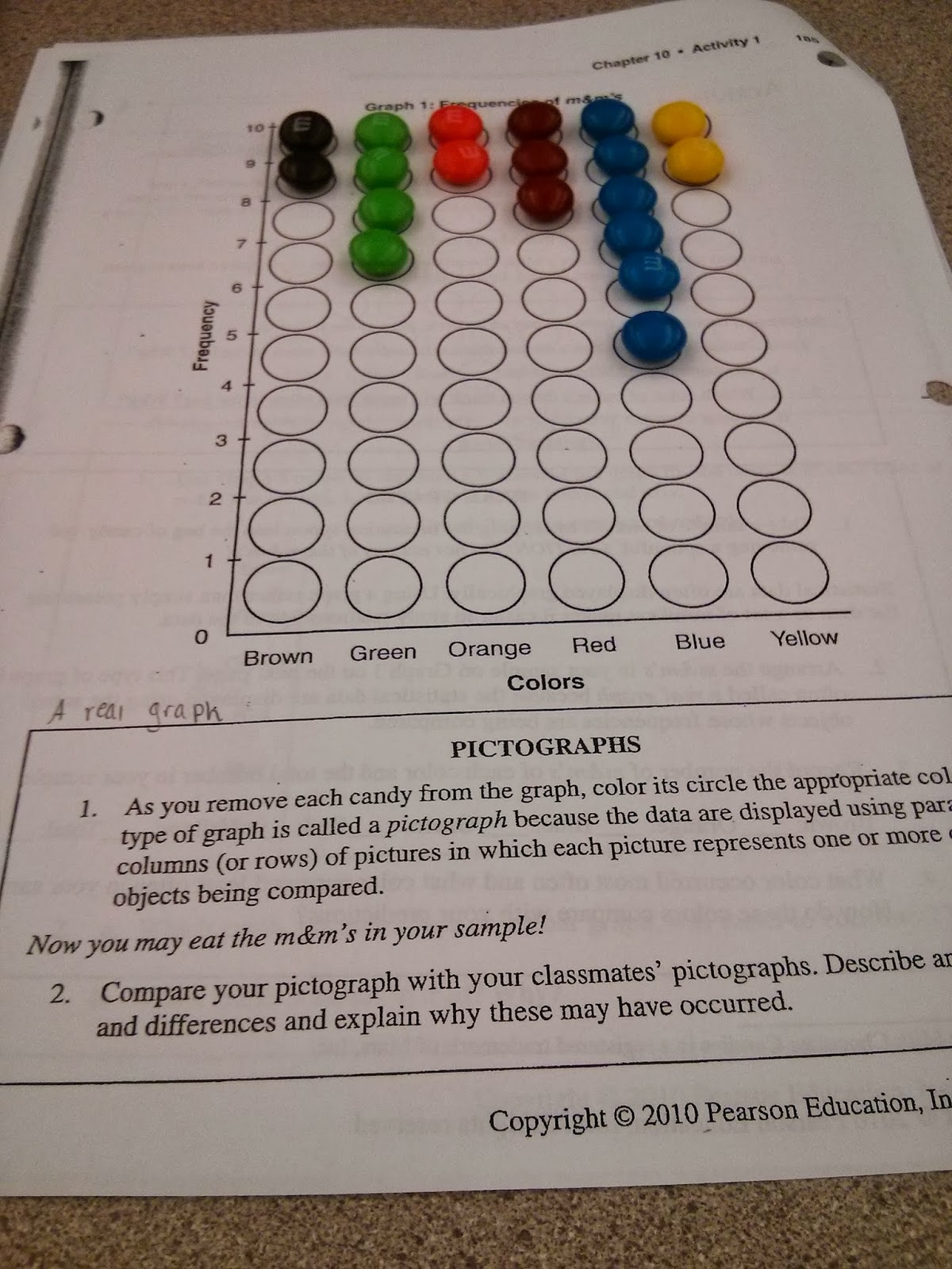
In almost every class I think, man, this class sure would be better with food. Guess what? My wish came true! We did an experiment for data analysis and statistics using a small sample of regular m&m's and got to eat them afterwards. Score.
 Before we began, there were two questions asking which color we think would occur most often, least often and why. I said blue would occur most because it's the color we all love, and brown would occur least because it's the ugly, boring color. Well we grabbed our sample and recorded how many m&m's of each color we had individually. Then we placed the m&m's on this pictograph and colored in the circles (notice how I did mine backwards, because I got so excited that I wasn't paying attention.) Next we added all of our class data together to find out if our predictions were accurate or not. Go back to post one where I describe Bernoulli's theorem. By putting all of our data together, it was really interesting to see what the results were. We then made a class dot plot and on our own we made both a pictograph and a bar graph with the class data.
Experiments like this one are a really great way to get students interested in the topic they are learning. It is a great discovery method and gets them thinking about stuff in the world like, how do they choose how many colors to put in m&m's or how do retailers know how many clothing sizes to buy for each size? In addition to great learning, activities like this one are FUN and kids will love it.
The class results
Brown: 61 or 15%
Green: 79 or 19%
Orange: 88 or 22%
Red: 56 or 14%
Blue: 78 or 19%
Yellow: 45 or 11%

Right away when I read your prediction I jumped up. I also thought there would be more blue and less brown for the same reasons you stated. I like how you based off the Bernoulli's theorem because if we had opened more packages of m&m's we would see that theorem in effect. Writing the data and the graphs that you used was also great in order to visualize what the point of the activity was.
ReplyDelete